
I used to suck at using telling stories with data.
Despite having a B.A. in Communications and a minor in Visual Art, I was worse than most people at creating charts that could communicate a message.
My clients were frustrated and confused by my report deliverables. My managers tried coaxing me to make clearer charts. But my numbers seemed so obvious to me, and I couldn’t see why someone wouldn’t automatically understand 6 is more than 3 without a “+100%” next to it.
I thought the data speaks for itself. It does not.
Fortunately, I’ve gotten better at communicating with data over time, and I’m pretty good at it today.
But from what I’ve seen, most PPC reports that get shared online still suck, and are probably made by people who also think data speaks for itself.
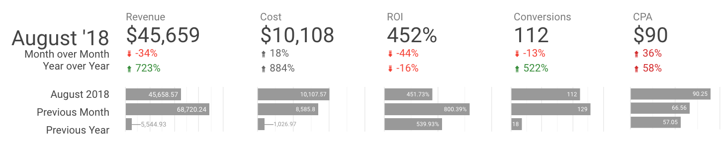
Here’s a chart that was featured as a great way to show monthly comparison data:
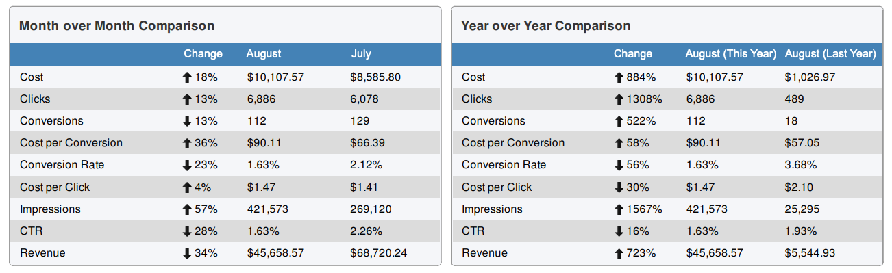
Now, to be clear, it is not easy to show 9 metrics across 3 different time periods. I get that it’s a challenge without a perfect solution. But this report shouldn’t be considered “best practice.”
- No hierarchy or prioritization in data. What I’d consider to be the most important metrics (cost and revenue) have 7 additional metrics sandwiched between them, making it hard to compare the 2 key metrics. All metrics seem stacked in random order.
No preattentive attributes. There’s no use of color, size, weight, positioning, contrast, or anything else that would make it easier for me to understand the relationship between key metrics. - Too much noise. This is partly a function of the 2 problems above, but the charts are noisy and redundant. There are 78 cells to consume in these 2 charts (which is a lot!). 21 cells are duplicate labels or metrics, adding to the noise.
- No clear action or story. I can see that we’re generally doing more than we did last year, and less than we did last month, but I don’t know what the full impact is.
The chart isn’t end-of-the-world bad. But! This screen shot is from a paid reporting template. I think if you’re going to pay for something, it should be better than what you can get for free.
So I’m going to see if I can create a better version using the same data and free tools. Here are my goals and (self-imposed) constraints:
Goals for new report:
- Goal 1: It should be immediately obvious how KPIs are performing.
- Goal 2: It should inspire meaningful questions about what’s happening or what needs to happen.
Constraints:
- I can’t cut any metrics from the new charts, even if I don’t find them useful.
- New charts should take up the same “page real estate” as the original charts- I don’t get extra space for graphs.
- It needs to be built in Data Studio with the ability to be refreshed.
Let’s get started:
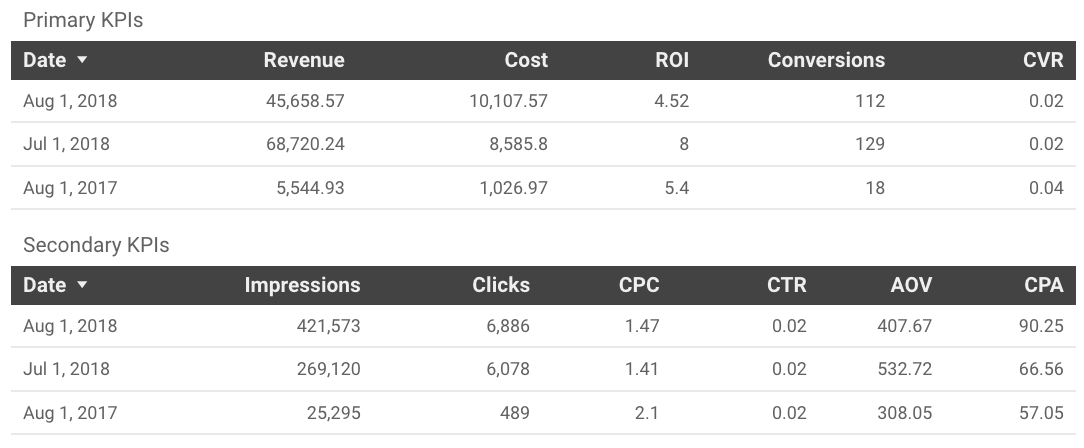
Step 1: Separate primary metrics from secondary metrics
Our report needs some hierarchy, which comes from prioritizing the metrics.
If I’m on the receiving end of this report, here’s what I want to know:
- First, how much revenue did we drive, how much did we spend, and how efficient were we?
- Second, what metrics contributed to the performance?
I’ll immediately name revenue and cost as primary KPIs.
Secondary metrics – metrics that only matter to the extent they affect business goals – will include impressions, clicks, CTR, CPC.
Since I’m not removing any metrics from the report, I’ve got a few decisions to make.
Sometimes Cost per conversion (also referred to as Cost per action, or CPA), is a primary KPI.
Because we have revenue data in this chart, I don’t think CPA matters quite as much. I care more about conversions (sales) and conversion rate (CVR). I also want to see return on investment (ROI). ROI isn’t in the chart, but I’ll add to mine.
With CPA as a secondary metric, I’ll add average order value (AOV) to note whether it’s consistent across months.
Now I’ve got my Primary KPIs:
- Revenue
- Cost
- ROI
- Conversions
- Conversion rate
And my Secondary metrics:
- Impressions
- Clicks
- Click through rate
- Cost per click
- Cost per action
- Average order value
Step 2: Format the data for greater visual impact
With my metrics grouped, I’m going to need visualization to help my readers know what’s important, otherwise they’ll be just as lost as before:
So my job now is to present the data in a more impactful way.
First I create scorecards with MoM and YoY comparisons. I also add “absolute change” for more context:
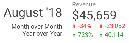
What’s working for me is a visual emphasis on the current month’s metric. I also like that the comparison metrics are colored to show positive (green) or negative (red) change.
But the scorecards don’t show me any actual values, and I think those are pretty important metrics, so I add in a labeled bar chart for each KPI.
You’ll see that I removed coloring from the comparison metrics for cost data. There are some metrics (like impressions and cost) that I usually feel are neutral. More spend or impressions isn’t good or bad, it’s only good or bad in the context of other metrics. So I leave them with a neutral grey, because I don’t want people to misinterpret the changes.
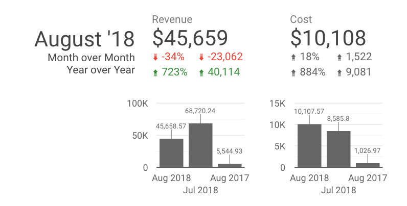
Looking at the bar chart, I like that I can easily see the values and comparison. I can process this data much more quickly. But it’s still pretty busy, and gives me a lot to interpret. James also thinks that there are too many comparison metrics to look at, and I have to agree.
In my next version, I ditch the absolute change comparison metrics, and I switch from horizontal to vertical bars. This lets me use the 3 dates consistently for all charts, instead of reintroducing them each time. I also drop the axis labels so it’s easier to read.
I’m really liking how this is looking. The story around the KPIs is shaping up (more on that in a minute), and it’s easy to compare performance. Just a few more tweaks to tighten the vertical space, make the data labels more readable, and add some color to group the metrics. (This is where I also made the final decision not to include CPA as a primary metric.)
I’ll also add in secondary KPIs without the bar charts, because I want to keep attention on the primary KPIs.
Here’s a screen shot of my final version:
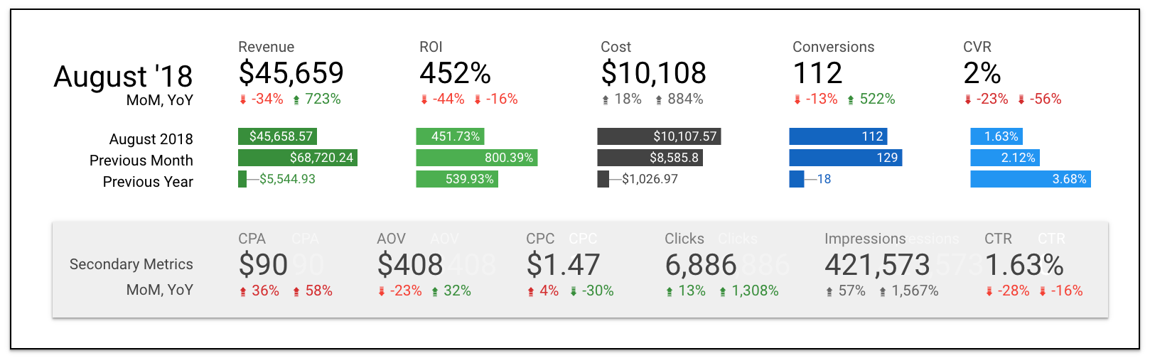
As you can see, I played with the order of the KPIs and how to represent ROI (number or percentage). I can also see the value of visually grouping revenue, cost and conversions together (inputs / outputs), and grouping ROI and CVR (relationships). That grouping would increase the visual contrast between YoY and MoM (with rev, spend, conversions all in a row). A case could be made for both groupings.
Step 3: Evaluate and Analyze
I’m happy with how the new charts look. I could show this report to my sister and she’d agree it’s an improvement, even if she doesn’t know what any of the metrics mean.
But my goal in this project wasn’t to make a pretty chart, it was to make it easier to learn from it. Let’s see how I did.
Goal 1: It should be immediately obvious how KPIs are performing.
With the help of the bar charts, it becomes clear that YoY comparisons aren’t going to be very useful. Whatever seasonality might be in play is eclipsed by the fact the account was running at such a smaller scale last year.
So I’m going to focus my analysis on MoM comparisons.
I instantly see that we spent 20% more, but our revenue is down by a third. The account was less efficient, with a lot more impressions and clicks, but fewer orders.
This has all the markings of increased spend on Display or a broad match search campaign, although I don’t know for sure (I don’t have backend data here). But I do have better questions to ask, which was my other goal for the project:
Goal 2: It should inspire meaningful questions about what’s happening or what needs to happen.
When I looked at the data in table format, I didn’t have real questions, just a general sense that we did worse month over month. Now that the data is well-organized, I have a better understanding of what happened, and more questions about what caused it the outcome.
- What campaign changes led to the increased traffic and spend this month? Why were those changes made? What did we learn from them? How will this inform what we do next month?
- Where did we lose revenue and sales this month? Did a single campaign have a bad month, or was performance worse across the entire account?
These are not rhetorical questions.
Maybe the account spent $10K because the client wanted to scale more, and we learned that we stop being efficient after demand on high-intent keywords is exhausted. Or maybe a new top-of-funnel initiative just launched with an additional budget, and reaching new audiences is more important than efficiency.
Was the decrease in sales due to natural variance, or were there changes to the landing page or offer?
The scorecards drive questions that I would expect to see answered in a report deliverable, either as a written analysis or with more visualizations.
Next Steps and Improvements
I consider the new chart to be a big step up from the original, but it’s not perfect. Here are a few ways I think it could be improved:
Customize for context. I don’t know who the decision makers are, or what they’re concerned about. But that would normally be a real factor in how I present data. For instance, if I knew they were focused on ROI, I might add a new metric with net revenue to show the value of scaling up, even if ROI takes a hit. I might add microcopy to better anchor our KPIs.
More metric details. Right now there’s no easy way to show actual metrics using scorecard comparisons, and there’s no way to show comparison across 3 dates in a single table. It was beyond the scope of this project for me to try to find a new way to show that data, but I would have liked to. Knowing that the CPA is up 36% MoM is useful, but I also want to know that it was $66 last month, compared to $90 this month.
Compact numbers in charts. Finally, I’d have liked to use compact numbers in the charts ($1K instead of $1026.97), but there’s no way to compact chart numbers within Data Studio yet, so the numbers are needlessly long.
All that said, I’m really happy with the charts I was able to make using a free tool. I met both my goals; performance is immediately clear, and drives good follow-up questions. I also stayed within my constraints for space and metric quantity.
Here’s the Google Data Studio report with the before and after versions:
Remember, we can’t just throw every metric in a report and “let the data decide.”
Data doesn’t make decisions. We do. And our ability to make good decisions depends on being able to understand the story behind the data.
PS. Have a report that needs a makeover? Send it my way, and it may be featured in another post!
Here at Paid Search Magic, we get pretty excited about all things related to getting better RESULTS in Paid Search Marketing.
If you feel the same way, join us here.
You'll get our latest content and podcast episodes that will teach, inspire, and motivate you to achieve new levels of success with Paid Search.