Dear Software as a Service biz,
I am your ideal customer.
You designed your software with me in mind. You know that if I just test out your product, I’ll be hooked. I’ll be a lifer and an advocate. You desperately want me to start that trial.
You’re stumped because I’m not taking that next step you know would solve both our problems. You’ve done everything you can think of to make it easy for me to say yes to your offer.
You’ve made the trial free. You pop up to offer support. You’re not asking for my credit card info. You’ve removed distractions to keep me focused on your primary Call To Action. You’ve added cool videos and graphics. But I’m still not signing up. WHY?
You’ve been copying your SaaS friends and competitors to figure out what to put on your page, rather than thinking about me and my needs.
And for as attractive as it is, your site isn’t giving me what I want.
Here are some things you should know about me before you ask me to start your trial.
#1. I still don’t understand what you offer
I’m on your landing page, and figuring out what you do is an uphill climb.
Your headline tells me you’re a complete solution, or you’ll help me programmatically automate something, or you’re a world-class cloud based integration tool. I have no idea what that means. And it’s not because I’m not your ideal client, it’s because you aren’t making sense.
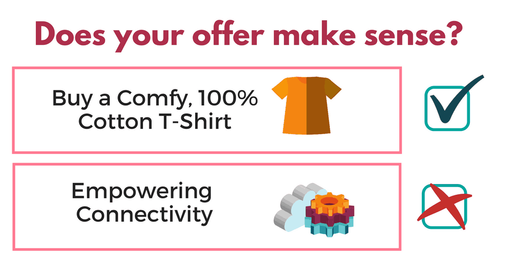
If you sold t-shirts, and I wear t-shirts, and I go to your website and there’s a headline about t-shirts, and a picture of someone wearing a t-shirt and a button that lets me buy a t-shirt, we’d be in good shape.
But you sell a thing I’ve never used, and I’ve never experienced it, touched it, seen it, or benefited from it in anyway, and I go to your website and there’s a random photo of a hipster drinking a coffee smiling at a computer, and the headline uses abstract terms to describe how awesome you are, and the only way I can find out what you offer is to invest time and effort into learning a new system with a trial… I’ve spent all my energy just trying to understand what you do, and now I need a nap.
It’s not easy to explain SaaS in a way that’s immediately understood; it’s abstract by nature.
But at the very least, if I’m looking for a service that lets me write and share meeting notes, I need to know if your service lets me write and share meeting notes. Saying it helps me cross-functionally collaborate with multiple teams doesn’t tell me that.
How to get clear on your offer
- Test and revise your page to make sure people understand it at-a-glance. Try https://fivesecondtest.com/ to get some crowdsourced feedback.
- Use your “above the fold” real estate to tell visitors both what you do and how it helps them, with as much clarity as possible. Don’t rely on “-ing” words in your headline. “Powering success,” or “Reaching across platforms” may sound slick, but can be very hard to unpack and understand.
#2. I want to watch your tool in action, solving problems
I want to watch someone successfully using your service to accomplish their goals, so I can picture using it myself to accomplish my goals.
You know this, which is why you made a video. But let’s be clear about videos.
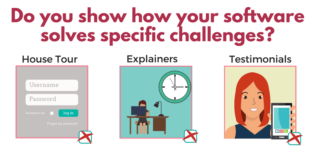
- I don’t want the house tour. Watching a screenshare where someone sets their password, logs in, navigates to the console, and makes selections doesn’t show me what I can actually do or or how your services solves my problem.
- I don’t want an animated explainer video. Those are fine when they are done well, but they usually aren’t. A 3 minute jingle about how Suzy was overwhelmed but now she uses your software and has free time to play with her dog doesn’t show me what I can actually do or how your services solves my problem.
- I don’t want to watch a video testimonial. Those can also be fine when done well, but they should be used as social proof, not as a hero feature about what your product does. Your current customers are not responsible to show how your tool solves problems, you are. You need to show me what I can actually do or how your services solves my problem
To speak a bit more about testimonial videos, because they’re becoming more popular… it usually only makes sense to show them AFTER we understand how your service works. Otherwise we lack the context needed to follow along with your users. Here’s a soundbite from a video I just watched:
“I love how I can log into the software and quickly see what’s going on in our stores.”
What the crap does this mean? Is she watching security footage? Is she monitoring inventory levels? Is she measuring foot traffic? Tracking revenue?
It’s not a bad thing for a happy customer to say, it’s just not a replacement for actually telling your visitors how the software works.
Imagine if you went to IKEA, and instead of seeing their showroom, you only saw the boxes. “Want to see what it looks like?” they say…. “No problem! Here’s a box cutter and a hex wrench….once you’re done assembling it, you can decide if you want to buy it.”
You wouldn’t want to invest 2 hours, or even 5 minutes, doing work to see if you’d even consider purchasing something. Why would you ask that of your own prospects?
How to showcase your software solving problems
If you need inspiration here, spend a little time watching YouTube or Buzzfeed videos. People love to watch unboxing videos, makeup tutorials, and “snack-size” recipe videos. It’s very satisfying to see the desired outcome with quick, edited shots of the steps needed to achieve the results… and it gives viewers just enough info to want to try it themselves.
#3. I don’t want to give you my information until I know your offer will solve my problem
You’ve been told that in marketing, you shouldn’t ask for marriage on the first date.
You probably thought this meant that rather than asking someone to buy your software outright, you need to let them take it for a test drive.
So it makes sense that you want to start with something easy, like a free trial or collecting an email.
Here’s the thing though.
Trials can be hard … that’s why they’re called “trials.” (Okay, that’s not true, but for the sake of your landing pages, you might want to imagine that it is.)
Sometimes interacting with a product is easy. If I’m in Costco and someone offers me a free sample of chocolate, I’m taking it without a second thought (as are my identical triplet sisters).
But your software is not easy to try out. Even the easiest and most intuitive software (Slack, Trello, Gmail…) still has a learning curve. I still had to:
- Create and verify an account
- Remember how to navigate to the software next time I wanted to use it
- Invest time & effort to learn how it works, following the onboarding series, and often searching through external articles for help
- Migrate my contacts or convince others to join me
- Migrate my workflow onto the new platform
- Establish a new habit of using it
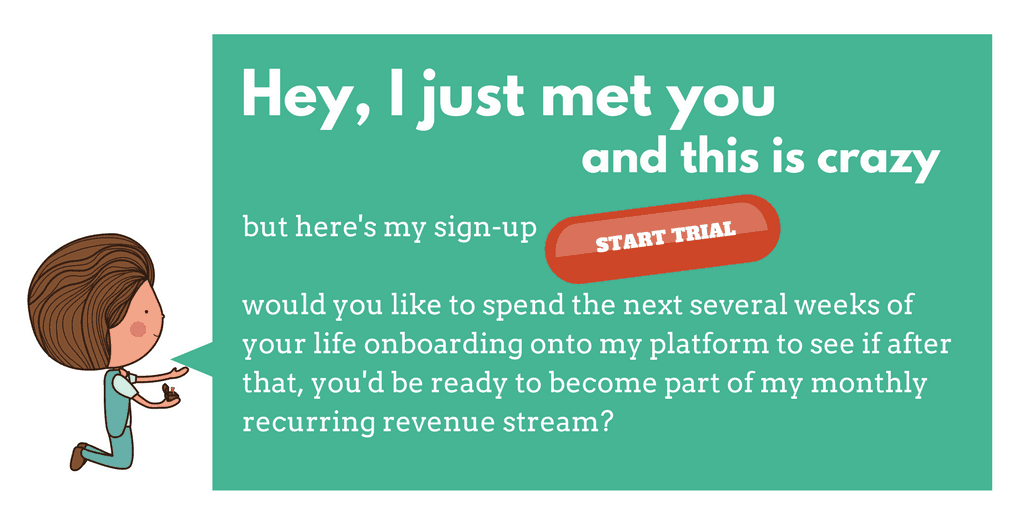
I’ve created many accounts I’ve never visited again, because I wasn’t ready to put that work in, or because I knew that after 7, 14, or 30 days, all that work would disappear unless the solution was $79/mo better than my current system.
Also, if the countdown for the trial starts as soon as I create an account, I’m going to be extra cautious about entering my info right now.
So I’m asking you, dear SaaS, to dedicate your landing pages to convincing me how wonderful my life will be after I sign up for your software. At least give me a glimmer of hope that all this work I do will lead to something great for me down the road.
If you don’t show me that, and just ask me to create a free account or start a free trial, you aren’t getting my contact info.
How to get my contact info
- Show your service in action before you ask me to try it out or create an account.
- If you agree that creating an account isn’t the right “next step” after introducing your software, give me something of value in exchange for my email so you can continue the conversation. Case studies and spec sheets typically aren’t a good exchange – they shouldn’t be gated in the first place. The right lead magnet usually helps solve common problems your visitor has so that you can continue to market to them through email while they’re considering their options.
#4. I don’t want to feel excluded from your SaaS party
You probably have certain assumptions about your ideal user.
A lot of my clients (SaaS or not) have a narrowly defined idea of their target market:
- High income level
- Specific job description
- Advanced education
- Extreme sophistication in the industry
- Deep familiarity with their offering
Many companies are actually afraid of pandering to their audience by doing things like explaining acronyms, using accessible language, or even using subheads and bullet points!
What happens is you end up alienating potential customers.
In 2001 I wanted to build a website for my dad’s company. I bought a copy of Photoshop, and got an upsell offer for GoLive that said it would help get me get online “on the fly.” I was brand new to HTML and I had no idea why I couldn’t just get the job done with Photoshop. I would have happily bought GoLive at the discounted price if I knew why I needed it, but they assumed I already knew, and lost the sale.
Don’t assume that only people intuitively familiar with your jargon want to buy your product.
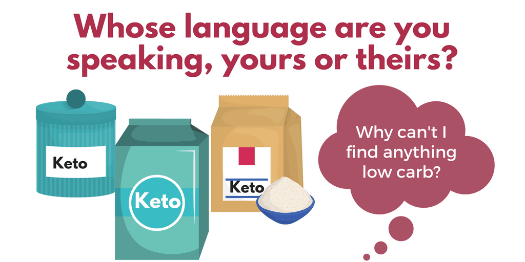
I’m very aware of my goals and pain points, and if your page takes the time to show me how you solve them, I’ll buy from you – even if I don’t know all the industry acronyms or terminology you assume I should know.
If your competitor makes me think they’ll solve my problems before you do, I’ll buy from them.
I’m in research mode right now. I have 5 tabs open that Google told me offer the same thing as what you’re offering.
The sale is yours to lose by assuming I already know everything about your product and you don’t have to explain it to me.
Even prospects who are just about to buy will appreciate not having to work so hard to figure out why they should choose you.
How to make your landing page accessible
Take a step back. Even if you assume your target client “gets it” – your marketing should speak to your target client 6 months ago (or 5 years ago). Remove the cognitive load of having to understand everything about your industry in order to understand the benefits you provide.
#5. I don’t just want to do the 1 thing you want me to do
If you’ve studied marketing and landing page design, you’ve been told that you need to have a dedicated landing page that only has a single call to action and that eliminates all other distractions.
On behalf of all of us offering marketing and landing page advice, I’m sorry about that.
As mentioned above, as your ideal client, I’m in research mode right now. I don’t want your funnel, I want to know if your offer meets my criteria. That means I care about:
- your price
- your terms
- your features list
- your integrations & platforms
- your unique differentiators
- the stage at which I’d want to upgrade
Many landing pages make it impossible to find this information – they’ve stripped the full navigation and links from the page. All a visitor can do is sign up or close the tab and move on to the next tab with a competitor’s site.
Often, the person doing the research needs to get buy-in from others in the organization. The easier you make it for them to do that, the more likely it is they’ll choose your solution over others.
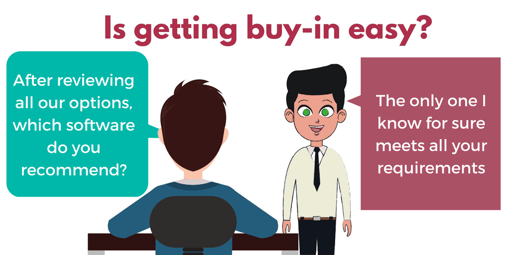
When you only give me one option, and it’s not the option I want, you’ve lost the chance to continue the conversation.
To restate, “Get started for free” is not compelling when getting started takes work, and I don’t know what’s on the other side of Free (in terms of either benefits or cost).
How to keep people engaged:
This one’s easy. Keep global navigation that has information about terms, pricing, and features.
#6. I don’t know what you mean by “Demo”
Finally, let’s talk about your demo.
Because if you’re telling me I can demo your software, you probably know what you mean by that. But I don’t.
I’ve seen “demo” refer to:
- A sandbox account where I don’t have to create my own login but I can simply get a feel for using the software
- A video playback where I can see an overview of the software’s features and benefits
- A webinar or feature tour where I watch someone show how to accomplish basic tasks within the interface
- A live 1:1 sales pitch where someone shows me a powerpoint presentation and then tries to get me to sign up
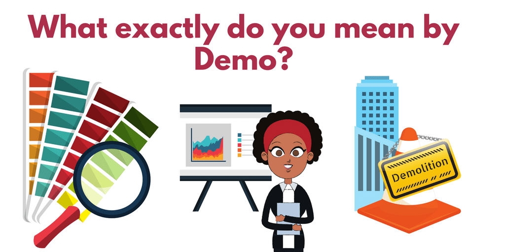
Because your service is hard enough for me to conceptualize, please be extra careful to tell me exactly what I’m going to get when I take you up on your invitation.
The same holds true for trials. I’m often confused as to whether the trial is full-featured or has limited functionality. If I want to try a certain feature, I want to be sure it will be included after I onboard.
How to be clear about demos:
Don’t use demo as a short-hand. Explain what someone will get in exchange for signing up.
In conclusion…
As your ideal customer, I’m much more likely to sign up with you if you follow these principles:
- Be clear about what you offer
- Show your service solving problems (in action)
- Give visitors a good reason to share their information
- Don’t exclude people by assuming or expecting too much
- Don’t limit access to essential information
- Don’t be cryptic about next steps
As someone who drives qualified search traffic to SaaS pages, I can tell you that pages that meet these criteria have much better conversion rates than those that don’t.
Remember, a confused mind says no.
The goal of your page isn’t to impress or sound slick, it’s to remove the layers of confusion to help your target say yes.
